
How to Match Countertops with Kitchen Cabinets During Kitchen Remodeling
A kitchen remodel usually starts with big decisions. Some people choose cabinets first while others begin with countertops, but both elements influence the final result together. The colors, finishes, textures, and materials all affect how the kitchen feels once everything comes into place.
When planning Kitchen Remodeling, matching countertops with cabinets is one of those decisions that can quietly shape the entire room. It is not always about creating an exact match. In many cases, balance matters more than similarity. This guide explores practical ways to make cabinet and countertop choices feel connected without making the kitchen look overdesigned.
Start With the Cabinet Style First
Kitchen cabinets usually take up more visual space than countertops, so they often help determine the direction of the overall design.
Before selecting a countertop, consider:
Cabinet color
• Door style
• Surface finish
• Natural and indoor lighting
• Overall kitchen layout
Light Cabinets
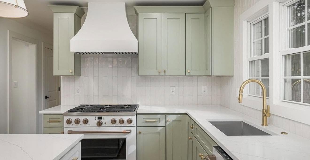
Cabinets in white, soft gray, or cream often pair naturally with:
- Neutral quartz surfaces
- Light marble looks
- Stone with soft movement
Dark Cabinets
Deeper cabinet shades often work well with:
- Brighter countertop surfaces
- Light veining
- Softer natural patterns
That does not mean contrast is always necessary. Similar tones can create a calmer and more connected appearance.
Think About Contrast Without Going Too Far
Contrast helps create visual interest, but too much contrast can sometimes make a kitchen feel disconnected.
A simple way to think about combinations:
High Contrast
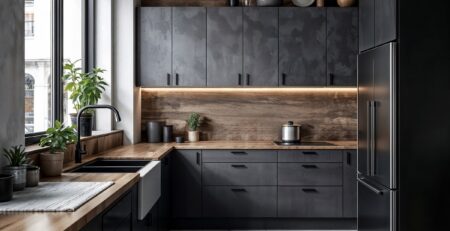
Dark cabinets + light countertops
Result:
- Strong visual separation
- More dramatic appearance
Low Contrast
Cabinets and countertops in similar tones
Result:
- Softer appearance
- More seamless design
Medium Contrast
Different shades within the same color family
Result:
- Balanced and flexible
Most kitchens tend to feel more timeless when contrast looks intentional instead of extreme.
Match Materials Based on Daily Use
Appearance matters, but everyday use should also guide decisions.
Popular countertop choices include:
Quartz
- Consistent appearance
- Lower maintenance
- Works with many kitchen styles
Granite
- Natural variation
- More visible texture
- Adds movement to the design
Marble Look Surfaces
- Softer visual appearance
- Often selected for brighter kitchens
Cabinet finishes should support the countertop instead of competing with it.
When reviewing how Kitchen Cabinets and Countertops Impact Your Kitchen, many homeowners realize that appearance and function usually influence each other.
Pay Attention to Undertones
Sometimes two materials seem similar but still do not work together.
Undertones often explain why.
Examples:
Warm white cabinets + cool gray countertops may feel slightly off
Beige cabinets + warmer stone usually blend more naturally
Cool gray cabinets + bright white surfaces can feel cleaner
A simple comparison process:
- Place cabinet samples next to countertop samples.
- View them in daylight.
- View them again under kitchen lighting.
- Compare before making final decisions.
Lighting changes more than people expect.
Use Texture to Create Balance
Texture can make a bigger difference than many people realize.
Too many smooth finishes may make the kitchen feel flat.
Try combinations such as:
Combination 1
- Smooth painted cabinets
- Countertops with visible stone movement
Combination 2
- Matte cabinet finish
- Polished countertop surface
Combination 3
- Shaker style cabinets
- Subtle countertop patterns
Texture adds depth even when colors stay neutral.
Homeowners exploring ideas similar to Kitchen Cabinets Greenville Sc often find that finish selection changes the final result more than color alone.
Consider the Entire Kitchen Environment
Countertops and cabinets should never be chosen by themselves.
Look at the complete space:
• Flooring
• Hardware finishes
• Wall colors
• Backsplash choices
• Amount of natural light
Questions worth asking:
- Does one surface overpower the other?
- Does the room feel too bright or too dark?
- Is there enough variation?
Small adjustments often create better outcomes than complete redesigns.
People comparing options similar to Granite Countertop Chattanooga Tn often review full kitchen combinations before deciding.
Avoid Following Trends Too Closely
Trends come and go faster than kitchen remodel timelines.
Instead of selecting combinations only because they are popular:
- Choose colors that feel comfortable long term
- Avoid overly busy patterns
- Think about maintenance expectations
- Focus on everyday practicality
The goal is usually a kitchen that still feels right years later.
For homeowners updating kitchens in Johns Creek and nearby areas, Georgia Cabinet Co Kitchen & Bath focuses on helping cabinets and countertops work together rather than treating them as separate design decisions.
Conclusion
Matching countertops with kitchen cabinets is not really about creating a perfect match. It is about finding balance between color, texture, material, and how the kitchen will actually function every day. A sample that looks great on its own may feel completely different once lighting and surrounding finishes are added.
During Kitchen Remodeling, comparing surfaces together and making slower decisions often leads to a kitchen that feels more natural and comfortable over time. When cabinets and countertops are selected as connected parts of the same space, the final result usually feels more complete.
FAQs
Should cabinets or countertops be selected first?
Most people begin with cabinets because they influence more of the kitchen visually and help narrow countertop options.
Do countertops need to match cabinets exactly?
No. Matching undertones and creating visual balance usually matters more than creating an exact color match.
Are lighter countertops easier to style?
In many kitchens, lighter surfaces work with more cabinet finishes, but maintenance preferences should also be considered.
Can neutral kitchens still feel interesting?
Yes. Texture, finish variations, and subtle contrast can add depth without relying on bold colors.